Typography is not a decorative afterthought. It shapes tone, hierarchy, readability, and character. A poor font choice can make a brand look amateur even when the rest of the system is solid.
What your typography should communicate
Before choosing a font, answer:
- Is your brand restrained or expressive?
- Technical or approachable?
- Premium or functional?
- Built for long reading or mainly for visual impact?
Your typography should reinforce that character, not fight against it.
A simple rule that works
Most brands need:
- One primary typeface for headings
- One typeface for body text
In many cases both can come from the same family. Simplicity helps.
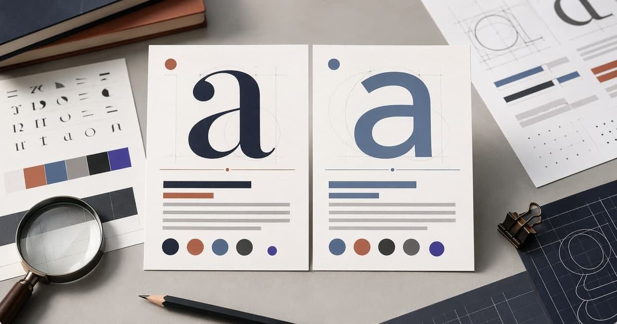
What to evaluate in a font
Readability
It should work in small sizes, on screens, and inside long text blocks.
Personality
An elegant serif does not communicate the same thing as a geometric sans. Form changes perception.
Availability
If the team cannot easily use the font across web, presentations, and documents, implementation becomes harder.
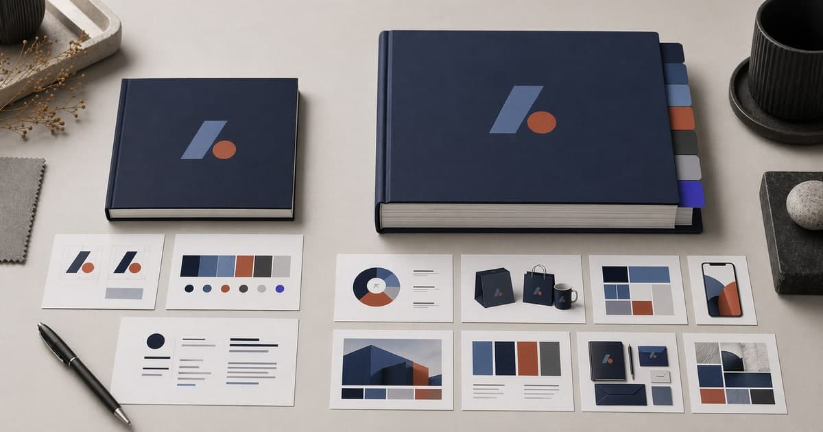
Create your professional brandbook in 15 minutes
Define your brand so your originality stays consistent when using AI
Combinations that usually work well
- Serif for headings + sans for body text
- Expressive sans for headings + neutral sans for paragraphs
- One family used across multiple weights
Common mistakes
- Choosing fonts based on trend instead of real use
- Using too many families
- Mixing incompatible styles
- Ignoring contrast and size
- Not testing the font in real contexts
Practical recommendation
Always test typography in:
- H1 and H2
- Long paragraphs
- Buttons and forms
- Mobile and desktop
If it only works in a beautiful mockup, it is not enough.
Frequently asked questions
How many typefaces should a brand use?
Most brands work well with one or two type families. More than that usually increases visual noise and makes consistency harder.
Are Google Fonts good enough?
For many brands, yes. They simplify implementation, licensing, and consistency across digital products. Premium fonts can be useful when you need a more distinctive identity.
Create your professional brandbook in 15 minutes
Define your brand so your originality stays consistent when using AI